Scenario
Last night the residents of McCormick hall realized that they were done all their assignment for the week and remembered that finals don't start for another 3 days. A few close friends thought it would be a good idea to throw a party. A few of the friends went to buy snacks and "drinks", the remaining stayed and started printing out flyers. During the printing, they got a little too excited and began pulling the paper out before it was done printing. This eventually left the printer with some weird error message (0EE!7). The students, being responsible young adults, logged onto MIT's Fixit website to submit a repair request for the printer.
The following morning Michael McIntyre, Housing Manager of McCormick Hall, walks into his office. He logs onto his computer and navigates to our web application, `appname`, where he views the current repair jobs, along with the new repair jobs which have come in and are already heuristically prioritized. However, Michael decides to move the broken printer repair job to the top of the list because it’s finals week and because many students will be wanting to print out practice exams. He then assigns the new repair jobs to the dorm mechanic, Jenks.
Jenks walks into his office and checks the list of jobs assigned to him. He notes down the jobs he’s been assigned to do as well as their priorities. He begins working on the different jobs and writes down parts that he might need to order. In particular, he needs new fluorescent light bulbs to replace the lighting in the McCormick Date Room. At lunchtime, he logs back into `appname`, closes the tasks he’s completed, and notes that he needs new fluorescent light bulbs.
Michael returns from his lunch break and logs on to `appname` to check up on his active repair jobs. He sees that he’s received a notification from Jenks informing him that Jenks needs fluorescent light bulbs for him to replace the lighting in the McCormick Date Room. Michael uses `appname`’s address book feature to find Home Depot’s phone number and then place a bulk order for replacement light bulbs. He then updates the light bulb task on `appname` to indicate he’s placed an order for the needed light bulbs and that the task should be ready to proceed tomorrow morning. While he’s on `appname`, Michael also goes ahead and processes the new repair jobs that have come in since the morning.
Individual Designs:
Anurag
Sketch |
Design Description |
|---|---|
|
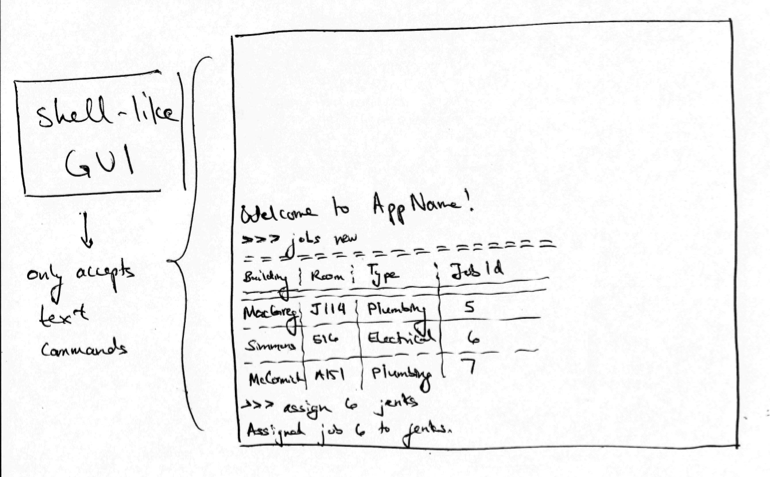
My first stretch design is for ultra-efficiency. To accomplish this, I sketched out a command-based utility, whose GUI is like most shell/bash applications. That is, the application accepts keyboard-typed commands ('jobs' or 'assign 6 jenks') and then outputs simple, ASCII-based feedback (like a table indicating new/active/recently closed repair jobs). Ideally, such an application is ultra-efficient for experienced users. This design may give us insight into creating text-based shortcuts for our application that allows advanced users of our application to work much faster. |
|
This is the main dashboard of my initial Gmail-esque design. The idea again was to provide comprehensive details about repair jobs via the listings in the middle panel and the focused details on the right panel. However, very much like Gmail, we want these listings to also easily be searchable/filterable so that the comprehensive information can be managed, hence the large search bars/tabs on the left panel which can be used to sift through the data (by searching for, say, 'MacGregor faucet' or 'McCormick refrigerator'). |
|
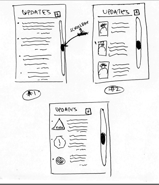
Alternative designs of the update logs in the Gmail-esque design. |
|
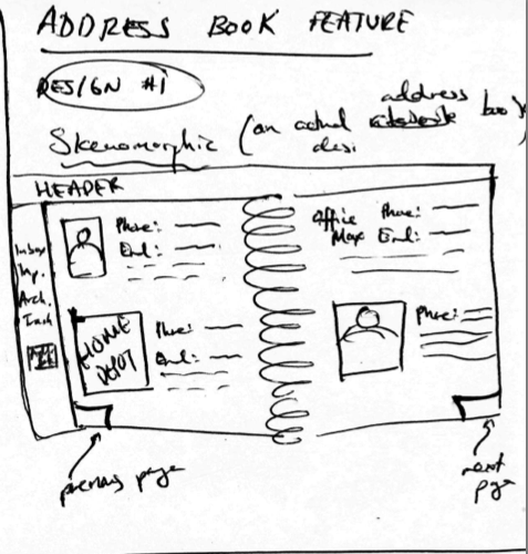
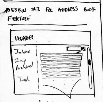
Design #1 for the Gmail-esque application's Address Book feature is a skeuomorphic design relying on a physical address book as the metaphor (complete with spiral ring, lined paper background, and having to click the bottom corners of the notebook to "turn the page" and navigate to next/previous contacts). |
|
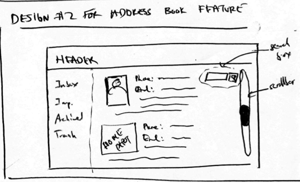
Gmail-esque Address Book Design #2 and #3 are much less tied to the notebook metaphor than Design #1. Both Design #2 and #3 include filters/search bars that allow you to easily sift through contact informations. The only difference is that Design #2 is more visual than Design #3 by also including visuals for each contact entry in the address book. But unlike the user interface for the main dashboard, it is not necessary for the user to see _as many_ address book entries as possible at the same time, so the visual approach (which takes up more space per contact entry) may be preferable. |
|
See above. |
|
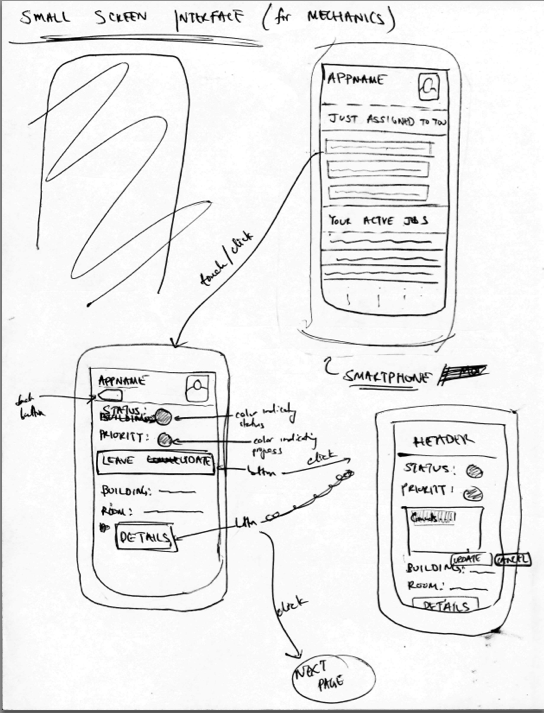
My third design is another stretch design: for mobile devices (i.e., small screens). This design is an attempt to port the previous Gmail-esque design to a smaller screen. The goal then is to really nail down what is most important to display to the user (especially the mechanic user class since mobile devices are more useful to mechanics who spend most of their time away from a desk). |
|
See above. |


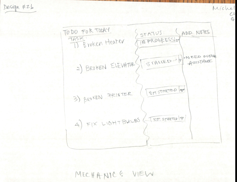
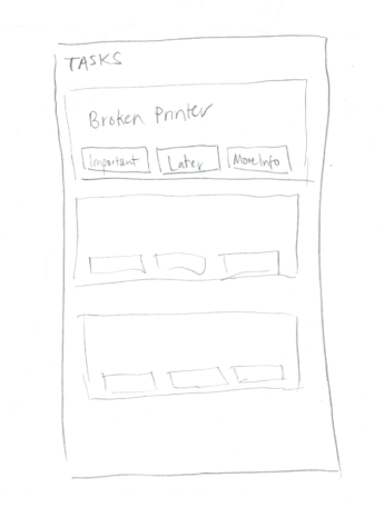
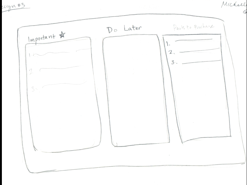
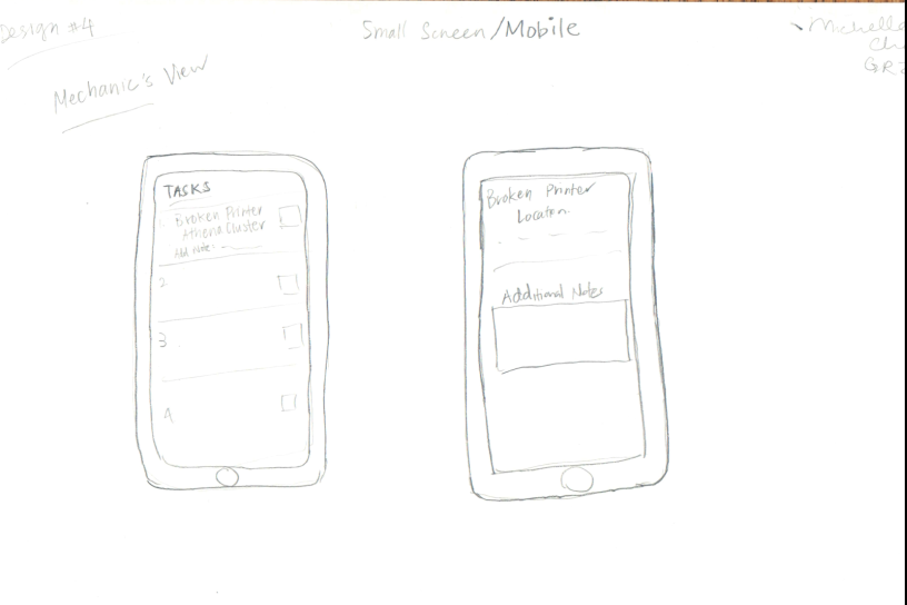
Michelle
Sketch |
Design Description |
|---|---|
|
Design 1: |
|
Design 2: |
|
Design 3: |
|
Design 4: |

Jeffrey
Sketch |
Design Description |
|---|---|
|
This is the first mobile design. The focus is to present the user with the information they need and allow them to easily take action. As a main use of the mobile web app would be to resolve the issue or comment on it, those opetions are easily available. The user may also want more information in which case they can drill into the job by clicking the side button. The main view will give a list of items (scrollable) and provide enough basic info to get the job done. |
|
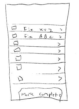
This was the second mobile design which focuses on efficiency. Items can be marked and then action can be taken (shown: `mark complete`, but other actions may be available. Similarly to the other design, jobs can be drilled into by clicking on them. The focus here is to allow a user who knows the problems well to just resolve the issues or delete them. |
|
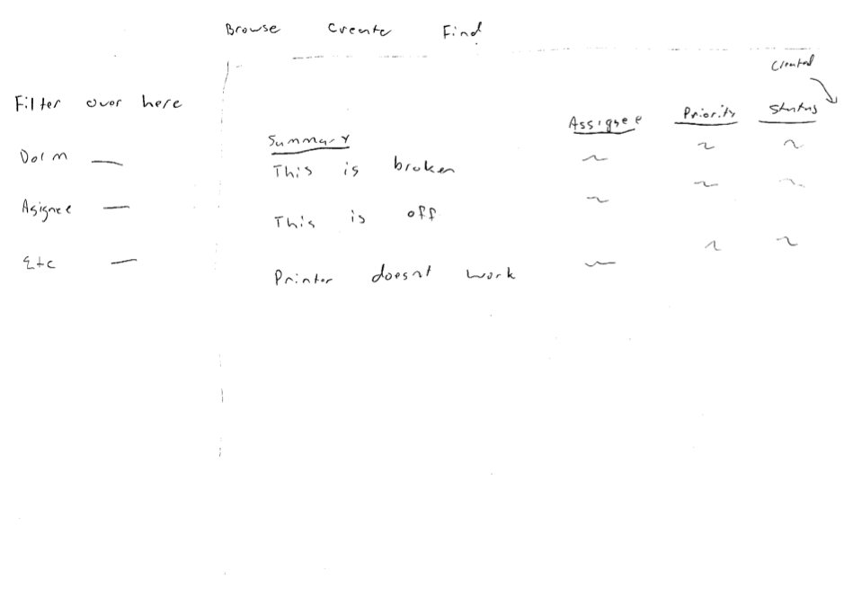
This design was focusing on showing the user everything they might need. This is done in a table format. The table headers may be used to filter by priority/assignee/etc. Moreover, filters are available to the user on the site and action items on top. |
|
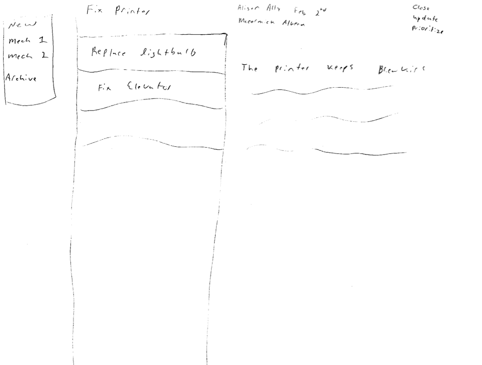
This was a run at showing jobs in a nicer maner. Jobs can be filtered then selected, information about the job is shown on the right. This allows the user to quickly drill into a specific problem they're having and filter out any noise. The view of the task could include things such as a notes/comment section, activity, etc. |
|
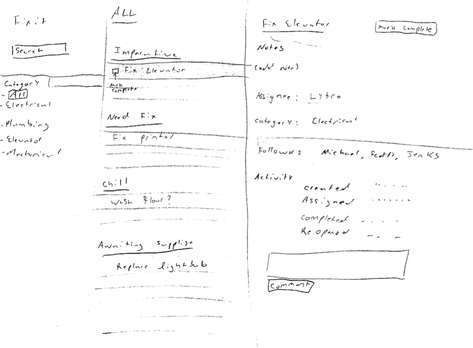
This design is similar to the above design except that it takes on priority sections in the middle panel. The view also has more focus on "activity" and notes/comments than the previous. The focus here was layout over specific details. There may be more actions or details noted on a specific task, but those might have been omitted here. |
|
This was a unique design that listed all the tasks. The tasks may have some indication of priority when they come in, or may be dragged/dropped into place. When the manager wants to assign a job to a worker, he may drag/drop it into place. The focus here is to allow the manager to do what he needs to do and be done with it. He can view incoming/existing jobs and then view the jobs per worker as well. |
|
This was an alternate for a closeup of an individual task. Again, the focus is on another design layout opposed to complete functionality. There may be more to this design such as `location`, `description`, `time`, etc. |

Rebecca
Sketch |
Design Description |
|---|---|
|
Design 1: |
|
Design 2: |
|
Design 3: |
 2.jpg)
.jpg)
.jpg)
Storyboards:
Storyboard #1 (Gmail-esque):
Sketch |
Design Description |
|---|---|
|
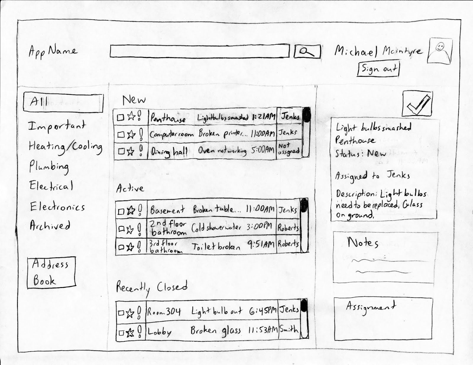
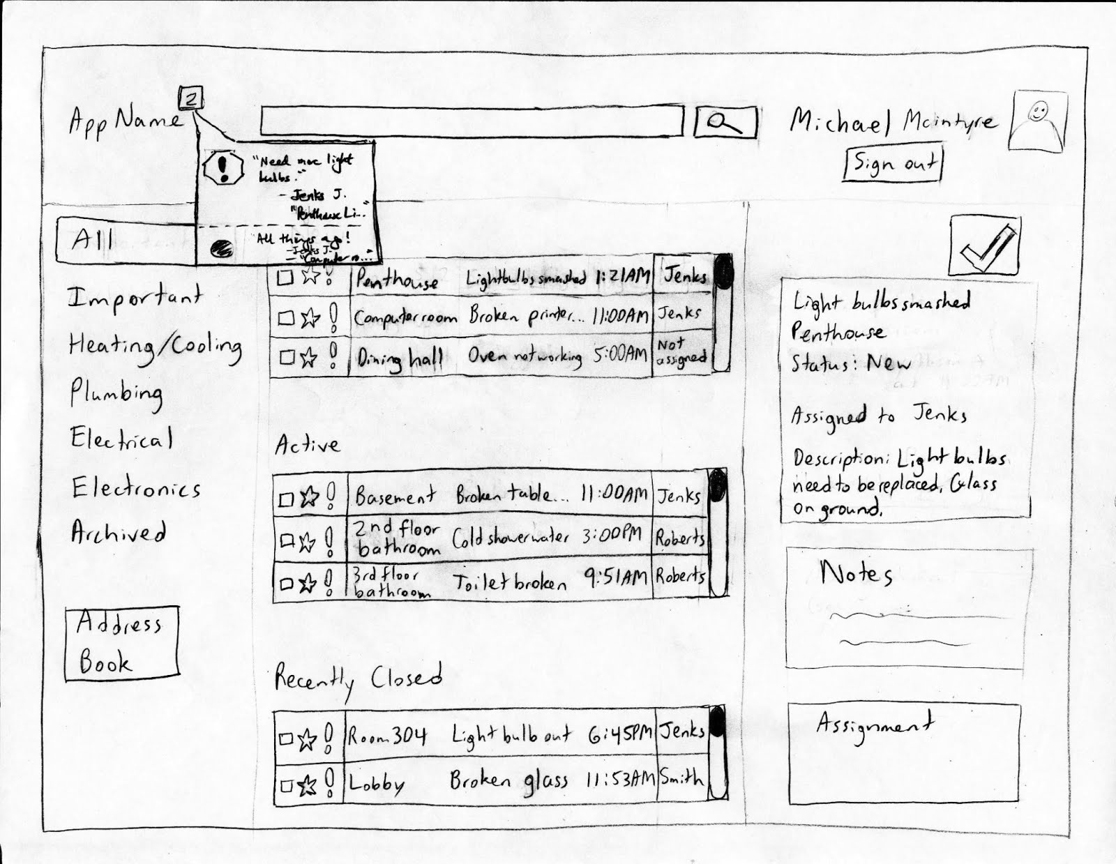
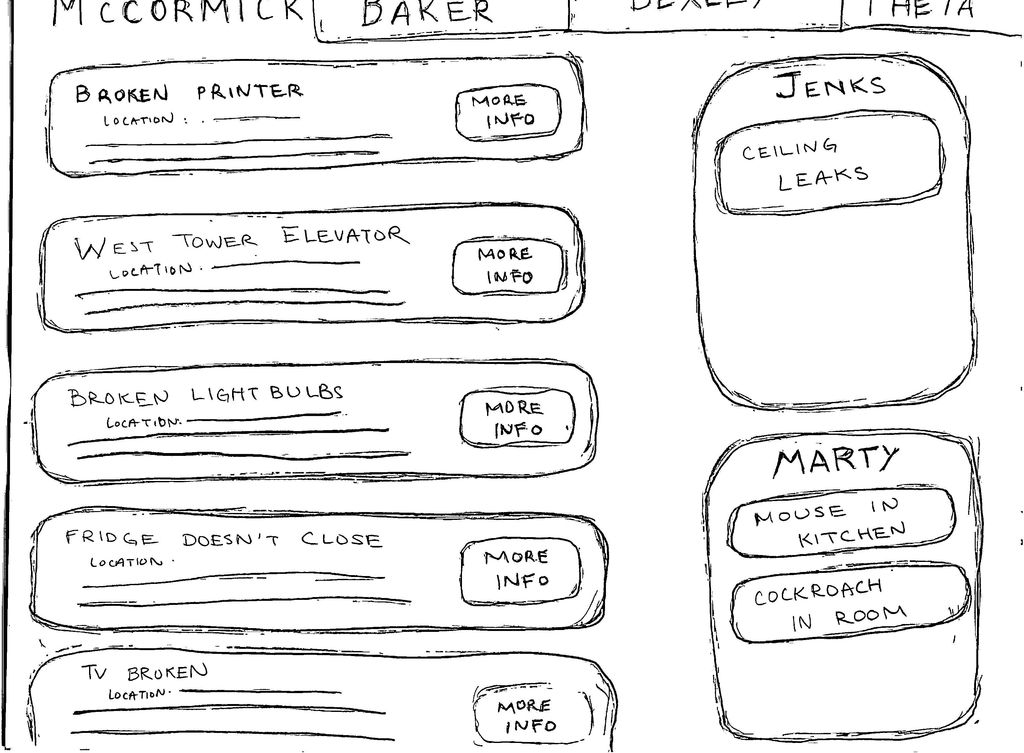
House manager Michael McIntyre logs on to ‘appName’ and sees all of his repair jobs in the center pane of the main dashboard. Michael decides the “broken printer” job should have a higher priority than where it is currently listed (at the end of the ‘New’ section), so he clicks and drags the event to the top of the ‘New’ section using the drag-and-drop affordance at the left of the repair job listing. (This prioritization is key not only for house managers so that they can more easily find important information about repair jobs but also for mechanics so that they know which jobs they should attend to first. The key here is that house manager prioritization affects the prioritization in the mechanics' view.) Next, Michael decides to assign the “broken lightbulbs in the penthouse” job to his mechanic, Jenks. He clicks on the job, which is then highlighted, and more details about the job appear in the right pane of the dashboard. |
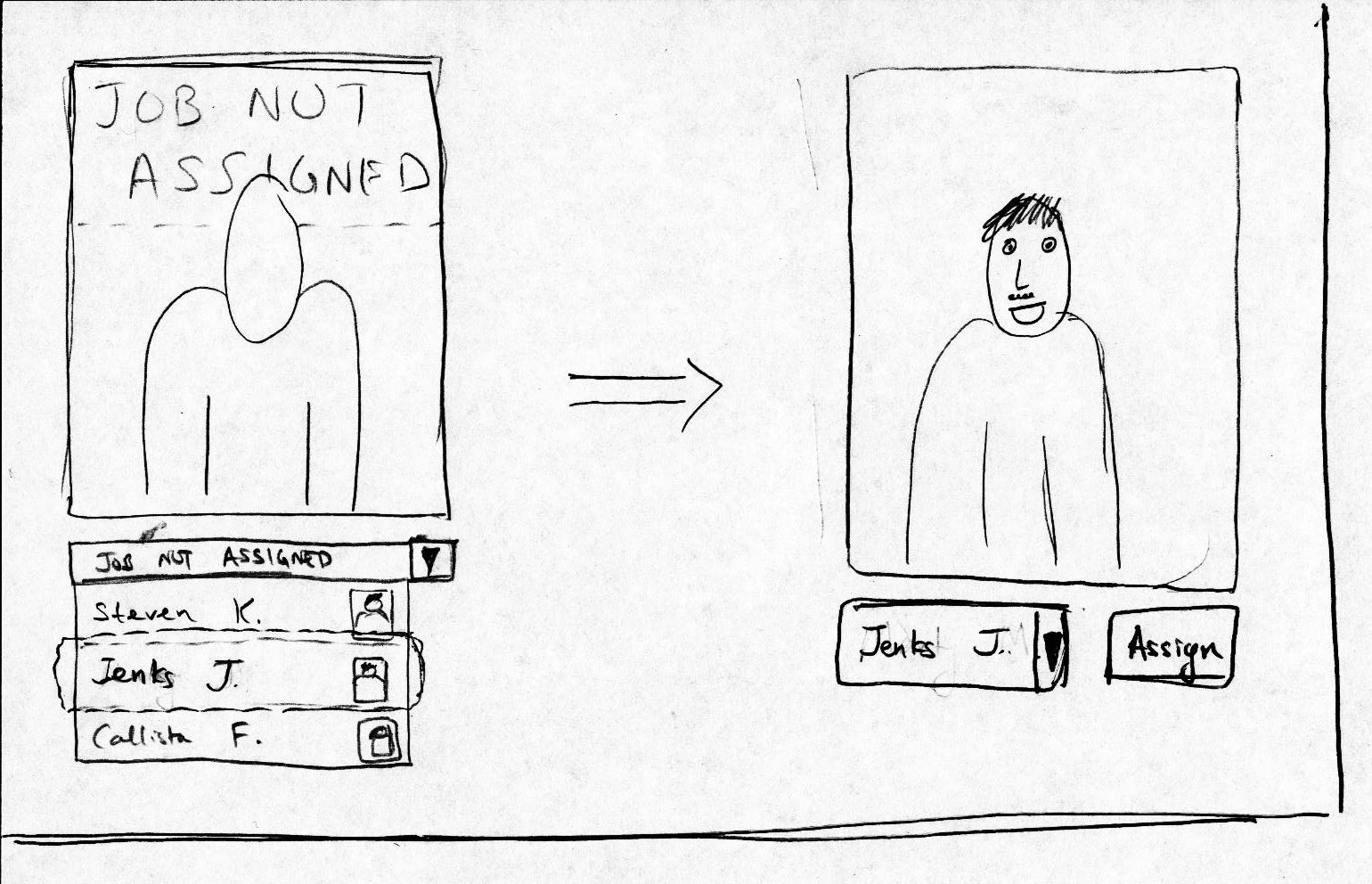
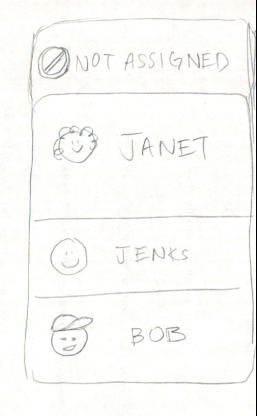
|
Michael can use the ‘Assignment’ area at the bottom of the right pane of the dashboard to assign the job to a worker. At first the worker picture is blank, and the drop down list says “Job not assigned”. Michael clicks on the drop down list arrow, sees a list of all his workers, and chooses “Jenks J”. The blank picture is now replaced by a photo of Jenks, and an “Assign” button appears which Michael can push once he is ready to assign the job. |
|
Jenks J. the McCormick Hall mechanic gets to work that morning. He logs on to ‘appName’ and notices on his dashboard (very similar to the house manager’s dashboard) that he has some new repair jobs assigned to him. (In essence, a mechanic’s dashboard focuses on presenting to the mechanic the new, active, and recently completed repair jobs assigned to that particular mechanic as opposed to presenting all repair jobs.) He notes down the jobs assigned to him in a notebook and heads out to complete the jobs. (Note: Same screenshot is used as Michael M.'s dashboard since UIs are very similar.) |
|
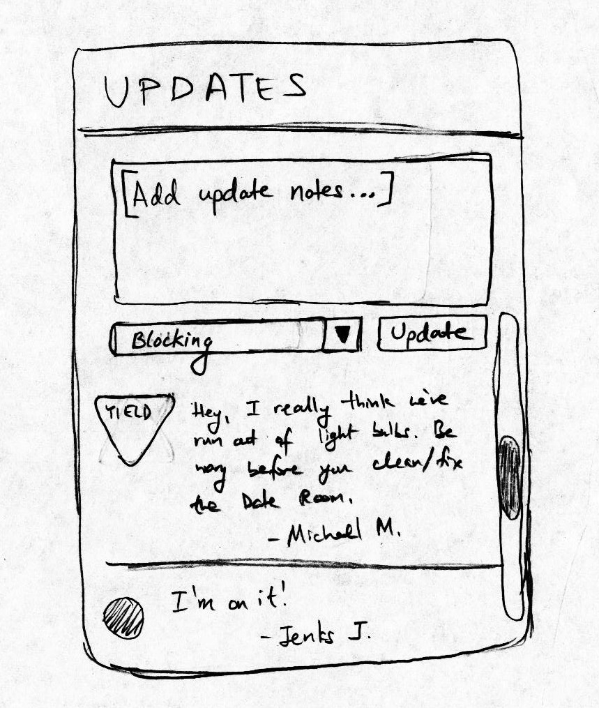
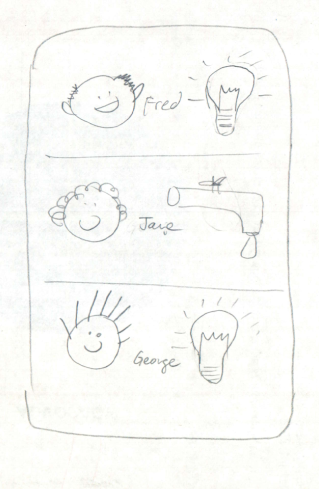
Jenks realizes that he needs more light bulbs in order to repair the lights in the McCormick penthouse. Each repair job has an update log that Jenks uses to record a new update; specifically, Jenks uses it to note that the job’s progress is being blocked because he needs more light bulbs. He submits this update by filling in a text description of the update, specifying the type of update via a dropdown menu, and then clicking ‘Add Update’. |
|
When House Manager Michael McIntyre returns from his lunch break, he logs back into ‘appName’ and notices (in the top-left corner of his dashboard) that he’s received a notification. He clicks on the notification alert to bring up a dropdown menu of notification summaries. He sees from these summaries that Jenks needs more light bulbs to proceed with the McCormick penthouse repair job. |
|
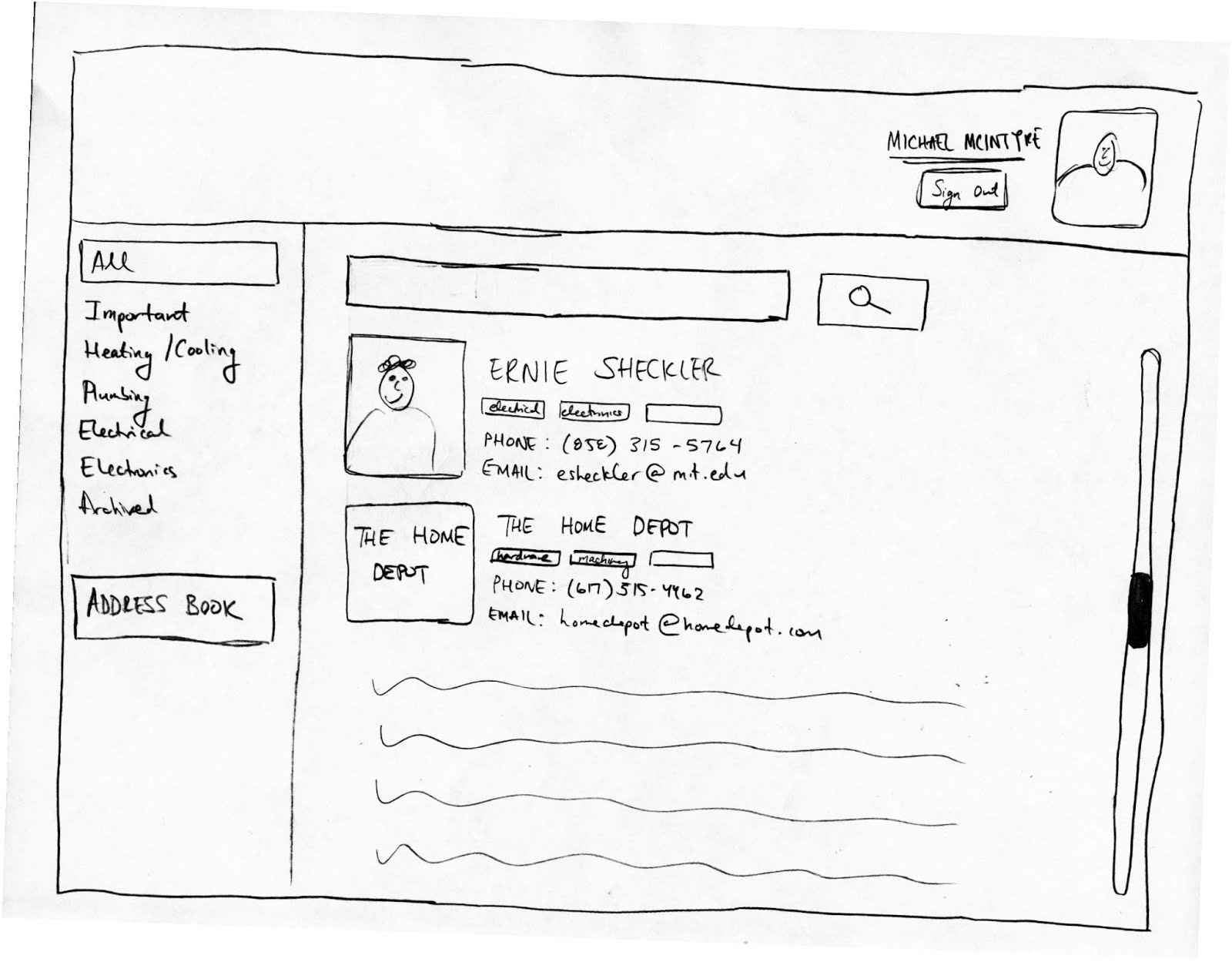
So Michael McIntyre uses ‘appname’’s Address Book feature to bring up a searchable, filterable list of contacts and their contact information. He filters through the contacts by clicking the ‘Electrical’ Tab, finds Home Depot’s phone number, and then places a bulk order for light bulbs. |
">Usability Evaluation
Learnability
+ The dashboard is externally consistent. It is similarly designed to Gmail and other task management systems.
+ The dashboard has a natural mapping. The newer jobs are at the top of the screen, ones in progress are in the middle of the screen, and ones that are completed are at the end of the screen. This layout follows the progress of a request job from start to finish; it moves down the screen as it gets closer to completion.
+ ‘appName’ has many affordances: scrollbars for seeing more jobs than currently on the screen, texture dots for dragging/dropping, button that says “Assign” next to a specific mechanic’s name to assign him to the job.
+ ‘appName’ offers feedback. Low-level feedback includes: when a cursor moves over a job or when the user selects a job, the job line is highlighted; when a user selects a particular filtering tab, that tab becomes highlighted. High-level feedback includes: when the manager assigns a job to a mechanic in the right-side pane, the mechanic’s name appears in the “assignment” area of the lists in the center pane.
+ In terms of interaction styles, ‘appName’ uses direct manipulation (drag/drop) and menus/forms (checkboxes, notes). These interaction styles are preferable to command language.
- The drag and drop feature for moving jobs around to change their priority may not be easily apparent. Since the interface is similar to Gmail and Gmail does not have the feature of physically moving emails around on the screen, the user may not look for this feature in ‘appName’. Also, the texture dots are small and we don’t currently have a way of making this feature obvious when the user sees the dashboard for the first time.
- There is currently no way for the user to seek help (no manual, no search bar for typing in problems and searching for solutions).
Efficiency
+ Search bar and filter tabs allow users to quickly find the specific repair job details they need at any given moment.
+ The dashboard chunks repair jobs into 2-3 groups (‘New’, ‘Active’, ‘Recently Closed’) of 4-7 jobs each. This makes it easier for users to parse and mentally manage the repair job listings on their dashboards.
+ The update log for each repair job also only presents at most 2-3 messages at once so that the updates are easily mentally manageable.
+ The design mostly (if not completely) features pointing tasks to the exclusion of steering tasks, which are far less convenient than pointing tasks (by Fitts’s law).
+ Frequently-clicked widgets (search bar, search button, address book button, sign out button, job completion button, etc.) are large for easier pointing and thus enhanced clickability.
+ Text areas for adding updates to a job’s update log use fragile defaults/pending deletes.
+ Application supports aggregation of multiple job listings for more efficiently executing operations over multiple job listings.
- Targets for selecting a job listing (via checkbox) and/or declaring a job listing as important are small, which detracts from easier pointing/clickability.
- There are a considerable number of pointing tasks in this user interface, but the targets for these pointing tasks can be quite far apart. This detracts from interface efficiency.
- We haven’t discussed adding command-based shortcuts to our application just yet. This detracts from efficient application use as well as detracts from making the application accessible to hard-of-seeing users.
- Search bar may not implement autocomplete for more efficiently searching through repair job listings.
- Defaults (e.g., automatically prioritizing repair jobs for users or automatically assigning certain jobs to certain mechanics) may not be provided to users, which hinders efficiency for commonly repeated tasks.
Safety">Safety
+ User interface will provide low-level feedback as to where in the dashboard, at any given moment, a dragged job listing will be dropped if a user lets go of the mouse at that moment. This helps users drag-and-drop job listings to the appropriate locations.
+ User interface provides low-level feedback when a House Manager user assigns a job to a given mechanic (e.g., by displaying the picture of the mechanic chosen) so that the House Manager can quickly realize if s/he is about to assign a repair job to the correct mechanic.
+/- Job assignments have to be undone by manually selecting a new mechanic (or None) to the job. This is not as efficient, however, as a command-based undo functionality.
- We haven’t discussed whether quick undo functionality (even one-level undo) will be implemented for undoing dragging-and-dropping of certain repair jobs to a new ordering/location. In general, we haven’t thoroughly discussed most undo functionality.
- Since we haven’t discussed whether this application will be mobile-friendly, it is possible that mechanics may not remember all the jobs they have to complete. (There’s no way for them to portably carry their dashboard wherever they go.)
- We haven't discussed yet whether a comment that the user is writing will somehow be saved in the case that the user mistakenly selects another repair job before he presses the “Update” button to add the comment to the update log.
Storyboard #2 (Drag and Drop):
Sketch |
Design Description |
|---|---|
|
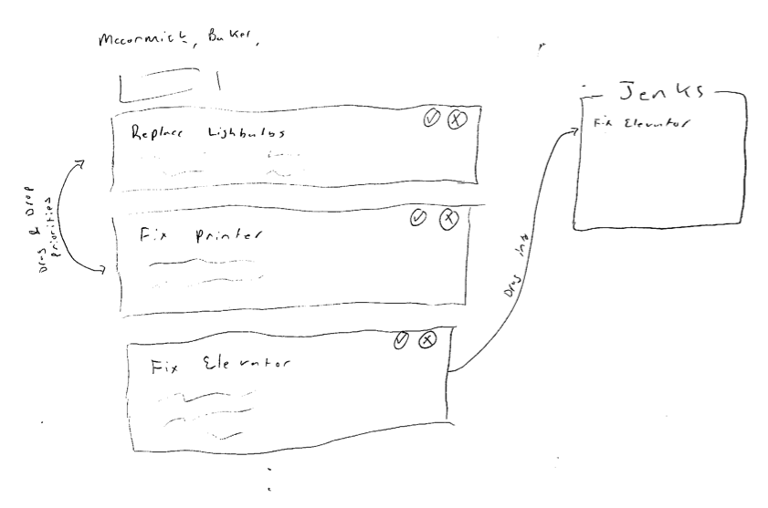
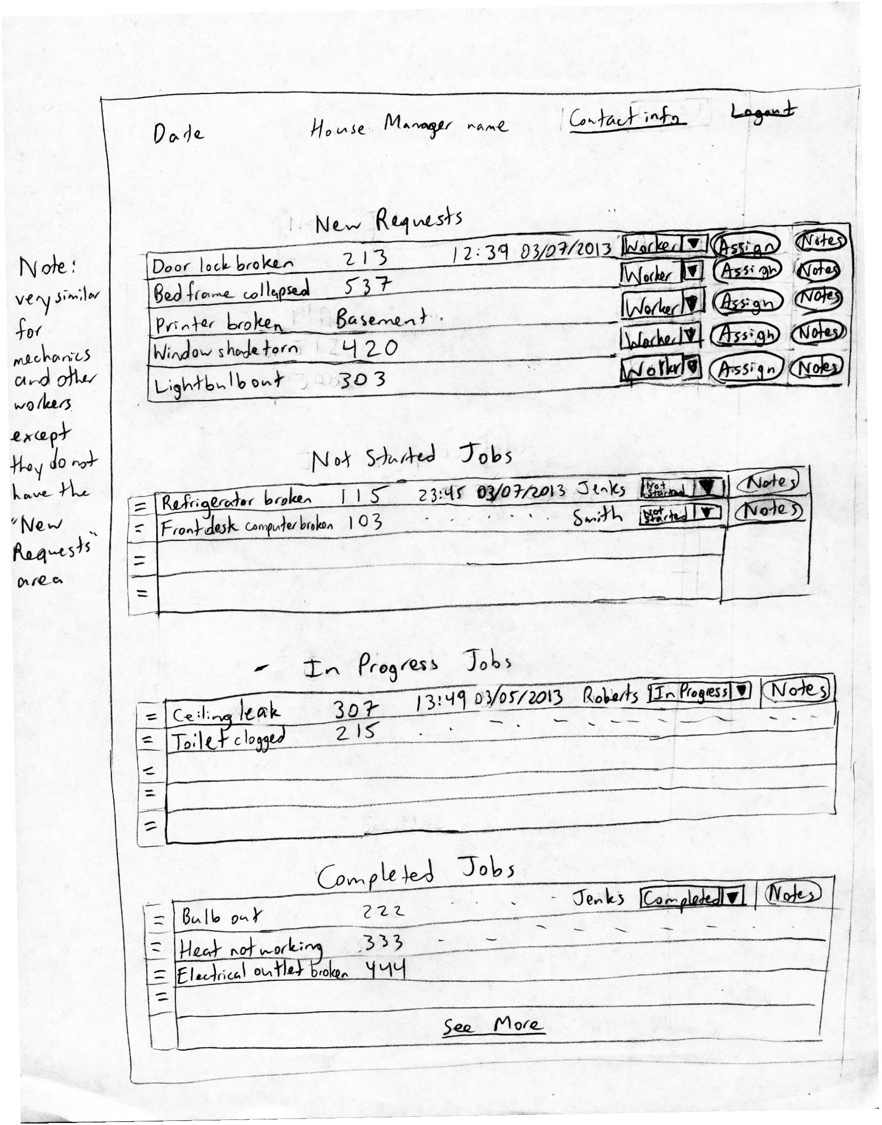
Michael is able to log into the app and see all of the new and unassigned jobs right away. They are ordered by time at which they came into the system. He is able to take basic action on them such as combine duplicates, resolve or close already completed job, and assign them to a particular worker. In order to combine duplicates, jobs may be dropped into each other or there may be check boxes for group processing. Not shown in the image, there will be a quick and easy way to close a job which may have already been done by the time the job was seen by Michael. Finally, jobs can be dragged and placed into a particular worker’s list. Michael can also see the jobs assigned to that worker that have not been closed. |
|
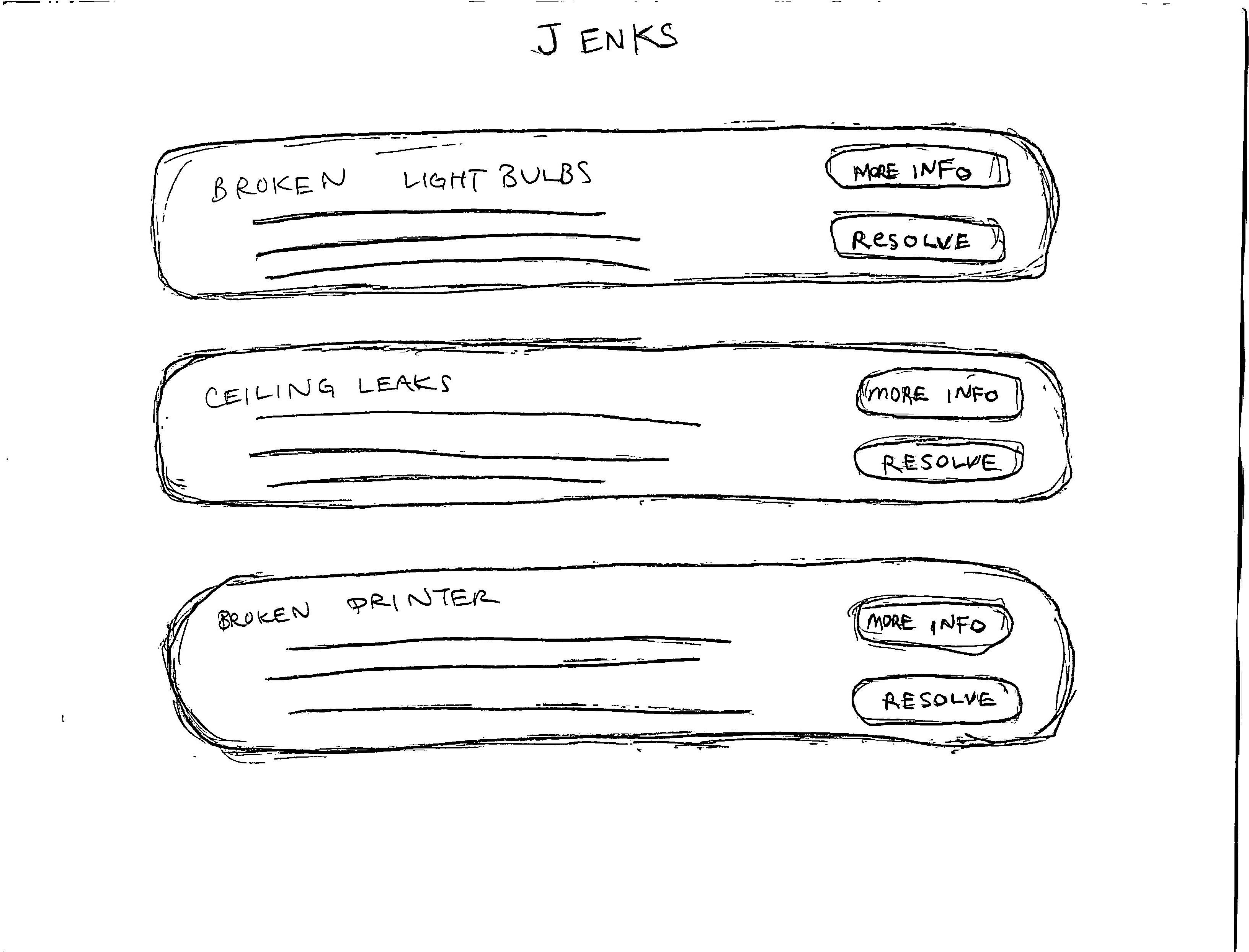
When Jenks, the house mechanic, logs into the app he is able to see the jobs assigned to him. Instead of being ordered by timestamp, his jobs are ordered by priority which is editable by Michael, the house master. Jenks can quickly take action by resolving the task. For many reasons he wishes to see more info on a job. He can do this by clicking more info. |
|
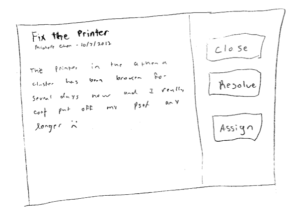
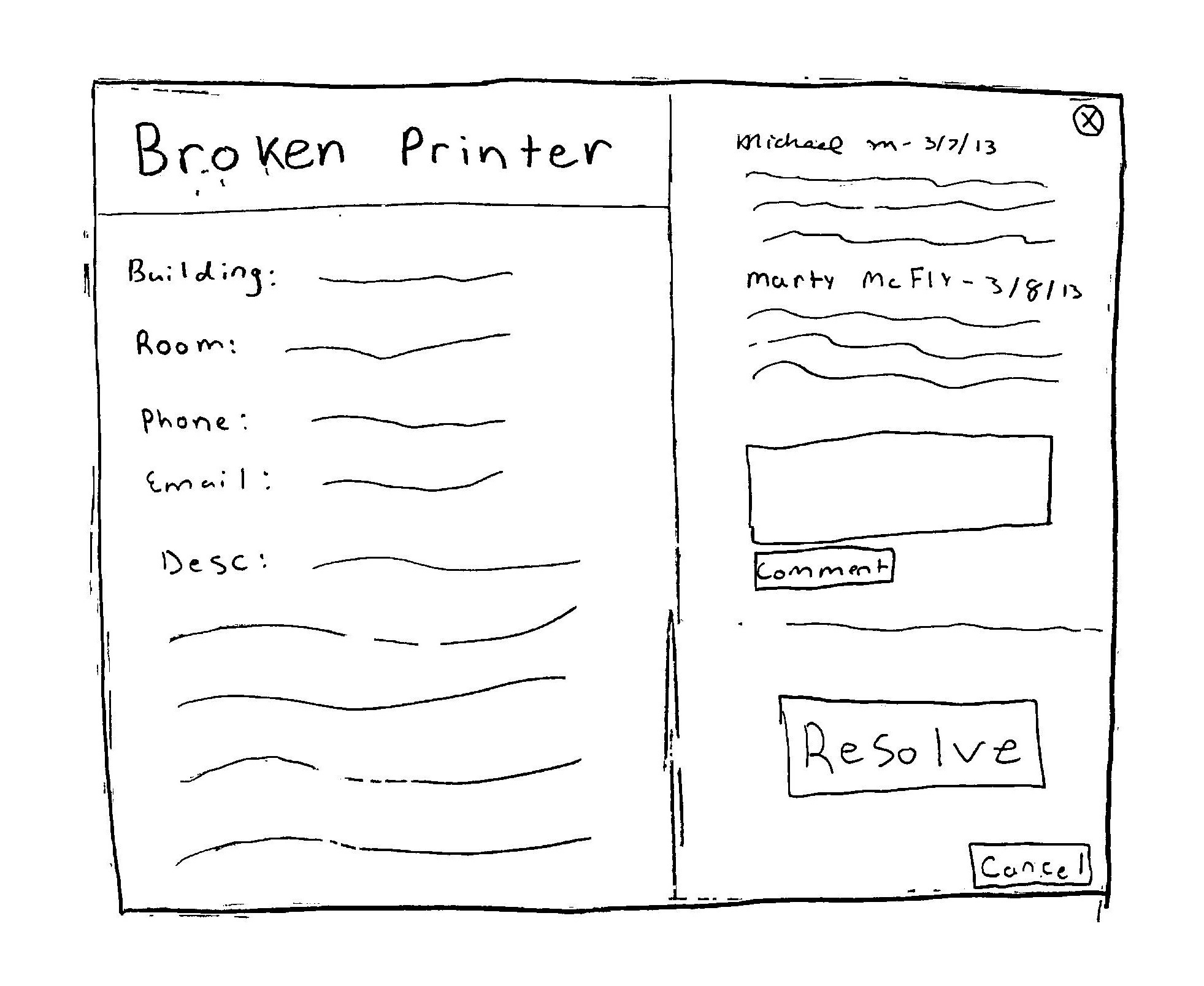
The view for more information shows all details for a given job. This includes information such as the reporter, time reported, location, full description, etc. Additionally, there is a way to comment on the specific tasks. When Jenks realizes that there are no more light bulbs, he writes a note which automatically notifies anyone following the task (in this case, it would be Jenks and Michael). |
Usability Evaluation
Learnability
+ ‘appName’ has many affordances: scrollbars for seeing more jobs than currently on the screen, texture dots for dragging/dropping.
+ In terms of interaction styles, ‘appName’ uses direct manipulation (drag/drop) and menus/forms (checkboxes, notes). These interaction styles are preferable to command language.
+ In terms of interaction styles, ‘appName’ uses direct manipulation (drag/drop) and menus/forms (checkboxes, notes). These interaction styles are preferable to command language.
- The drag and drop feature for assigning jobs and changing their priority may not be easily apparent.
- There is currently no way for the user to seek help (no manual, no search bar for typing in problems and searching for solutions).
Efficiency">Efficiency
+ Ability to quickly assign jobs to specific workers.
+ Grouping assigning possible
- It is hard to search for a given task. While there is no evidence from needfinding that Michael needs to search new/existing tasks, he may wish to be able to search through resolved tasks.
Safety">Safety
+ User interface will provide low-level feedback as to where in the dashboard, at any given moment, a dragged job listing will be dropped if a user lets go of the mouse at that moment. This helps users drag-and-drop job listings to the appropriate locations.
- The user may accidentally assign job to worker that was not intended. It may be possible to offer an undo feature to allow a user to quickly assign the most recent task (undo the most recent action).
- The user may accidentally close or resolve a job. In this case, the undo feature would be most useful. Otherwise, the user would have to manually go into resolved jobs and reopen it.
Storyboard #3 (Illiterate/Graphically intensive):
Sketch |
Design Description |
|---|---|
|
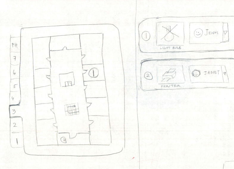
Sketch 1: Home Page |
|
Sketch 2: Drop down Menu |
|
Sketch 3: Address Book |
|
Sketch 4: Mechanic’s View |

">Usability Evaluation
Learnability
+ Easy to view problems associated with one particular floor since all of the jobs associated with one floor will show on the same task list.
+ Icons should be relatively distinct so that the users for the most part have an understanding. For example, the plumber can be described with a faucet symbol.
- Difficult to navigate to the jobs that are on various floors. For example, if there is a problem on the 4th floor, the user would have to navigate to the fourth floor tab and click on it to find the particular floor.
- Difficult for House Manager and Mechanic to initially understand what the symbols mean despite the fact that they should be graphical. Some symbols/icons sometimes have multiple meanings so the individual might be confused initially.
Efficiency
+ Great for the mechanic if he/she needs to scan every floor and determine which tasks are crucial before actually going to that particular floor.
+ The mechanic usually in charge of a particular building will be the default mechanic who the House manager can assigned which will make it easier for the house manager. He will not have to select to a different House Manager.
- Time consuming to have to navigate to every single floor and decide what tasks need to be addressed.
Safety
+ It will be easy for the house manager to correctly change the mechanic if he/she has assigned the task to the wrong person since Mike will just have to select a different person to do the task.
+ The profile pictures of the mechanics and outsider contractors will be useful for the House Manager because he/she will be able to confirm that the name selected is the one that he/she has reached out to before.
Studio Feedback
It is important to make sure the user has a notion of priority amongst the tasks.
- Doesn't seem to come through in the interface the (high, low, etc).
- No feedback other than that they're in a list.
- No affordance -- invisible piece of information.
I like the idea of notes associated with each task.
- Seems to be a part of the whole screen opposed to a specific task.
- What about dialog between two or more parties.
I like how there are different perspectives, but I'm curious if the address book is shared amongst different users.
What specifically is lacking in the current system that you're trying to address
- Right now they get a bunch of emails, small signal to noise ratio.
- They are currently mentally prioritizing tasks.
- There is room to expedite how they prioritize, org and track tasks.
Is the gmail interface supposed to be both an inbox as well as a prioritization mechanism
- We confuse the user because the our feature does not completely completely with the gmail metaphor
- Difference between using GMail as inspiration opposed to a metaphor.
Would it be important to have a mobile website or app for this sort of task?
- Mobile designs will be in our wiki, excluded from presentation.