Navigation
Click on a page above for a specific section.
GR3 - Paper Prototyping
Initial Prototype Photos
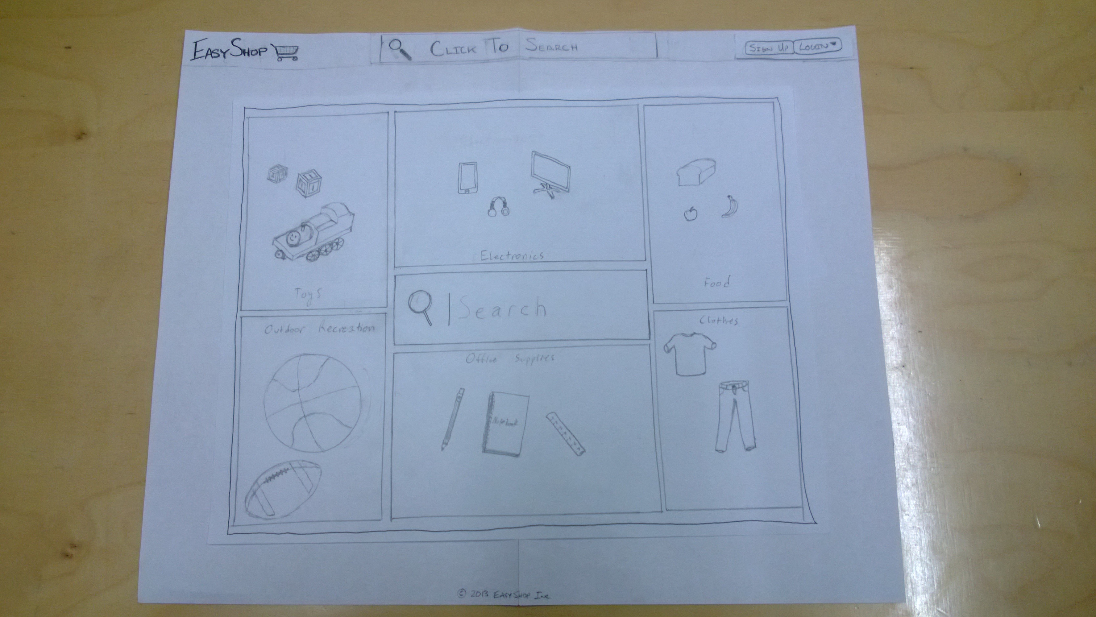
The EasyShop homepage
Features prominent search bar with large UI buttons to navigate to specific product categories
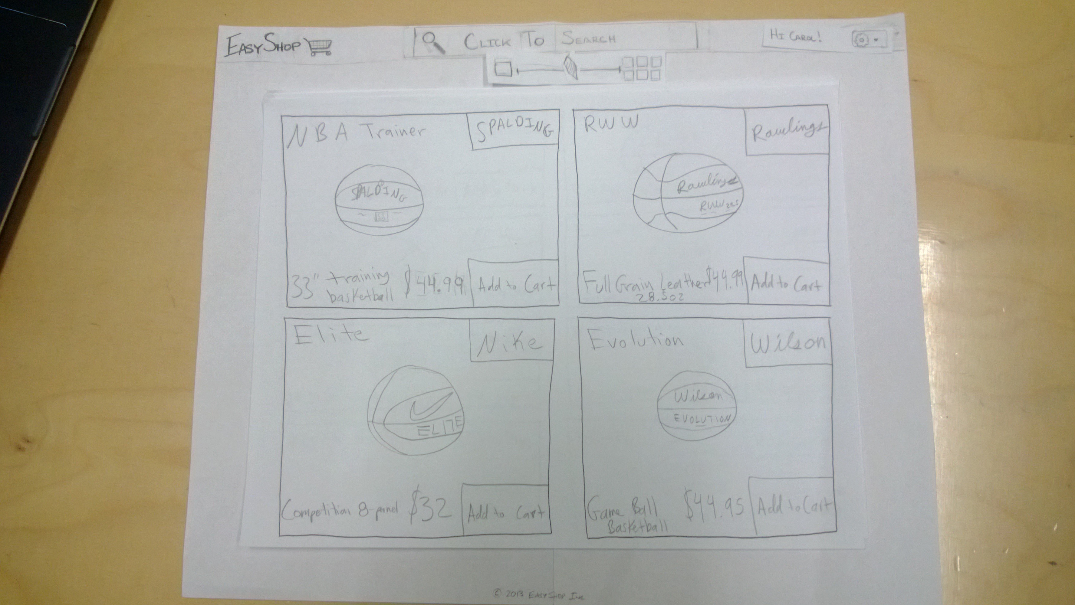
Search results page (medium sized elements)
Shows 4 results per page. Each result consists of a product title, price, and an image. Users can add products directly to their cart from the search results using the Add to Cart button
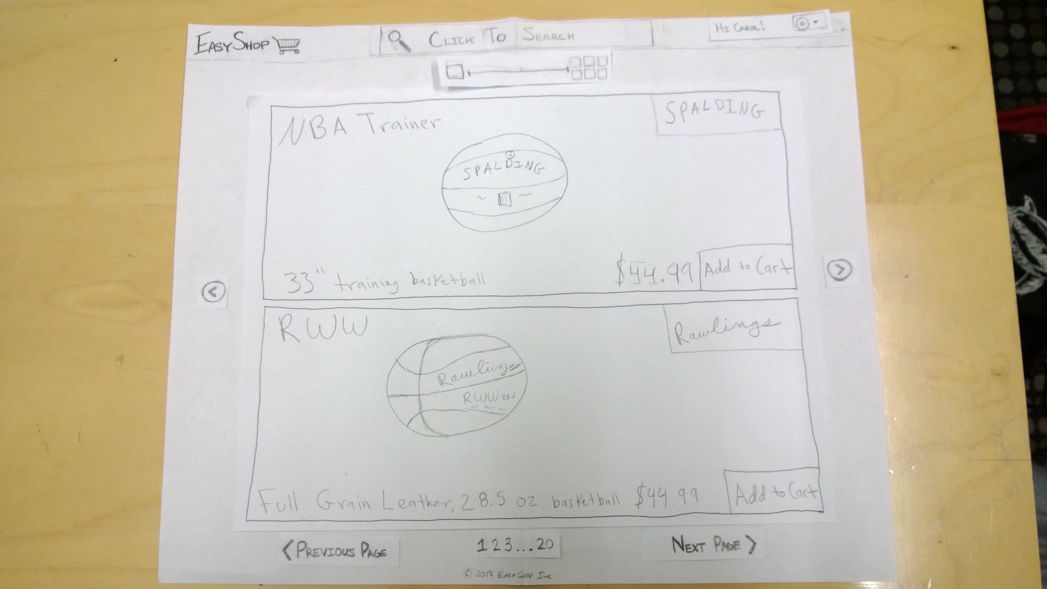
Search results page (large sized elements)
Shows 2 results per page
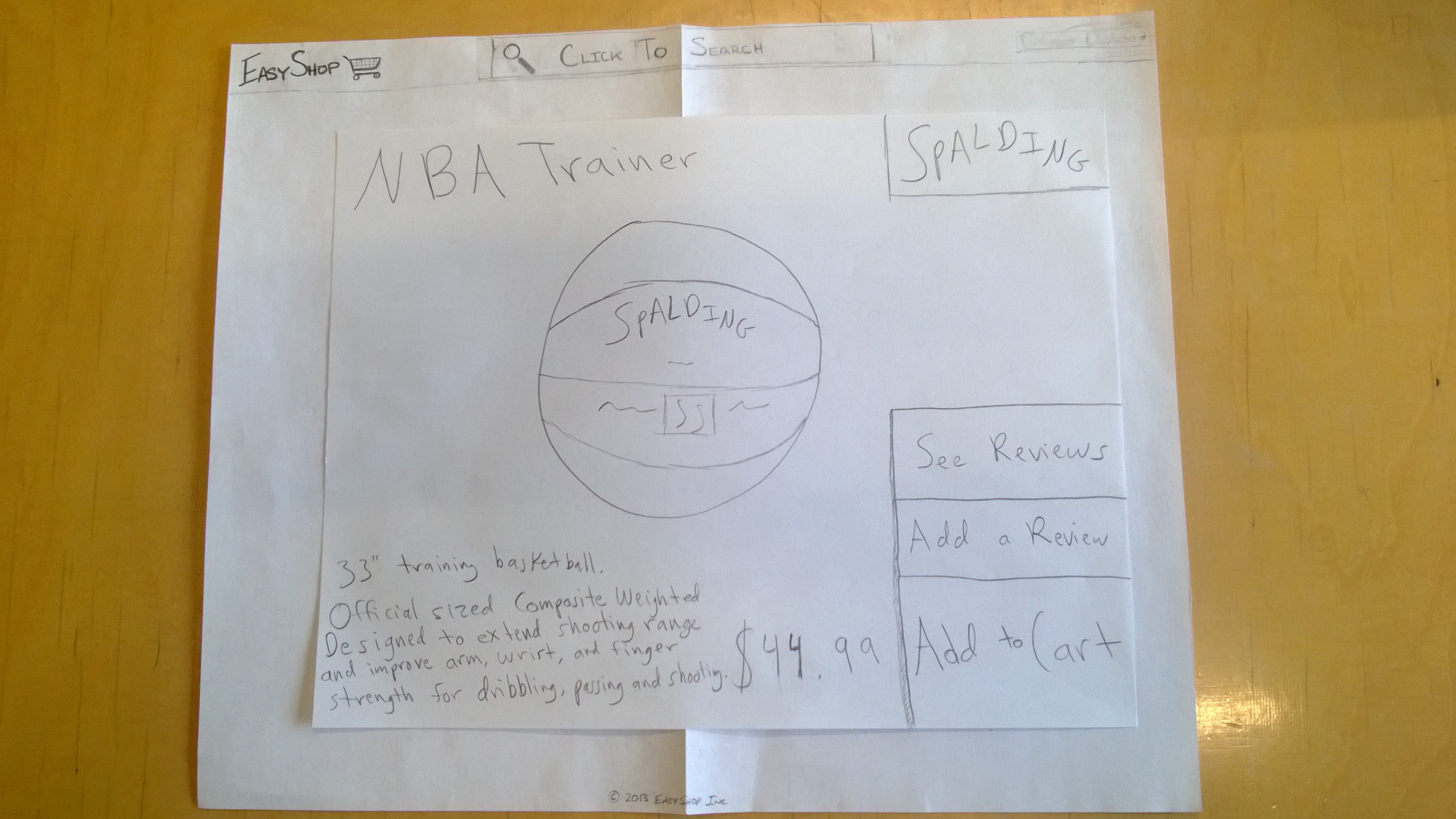
Product page
Displays description of product and the price. User can also use the large buttons on the right side to look at reviews, submit a review, or add the item to their cart
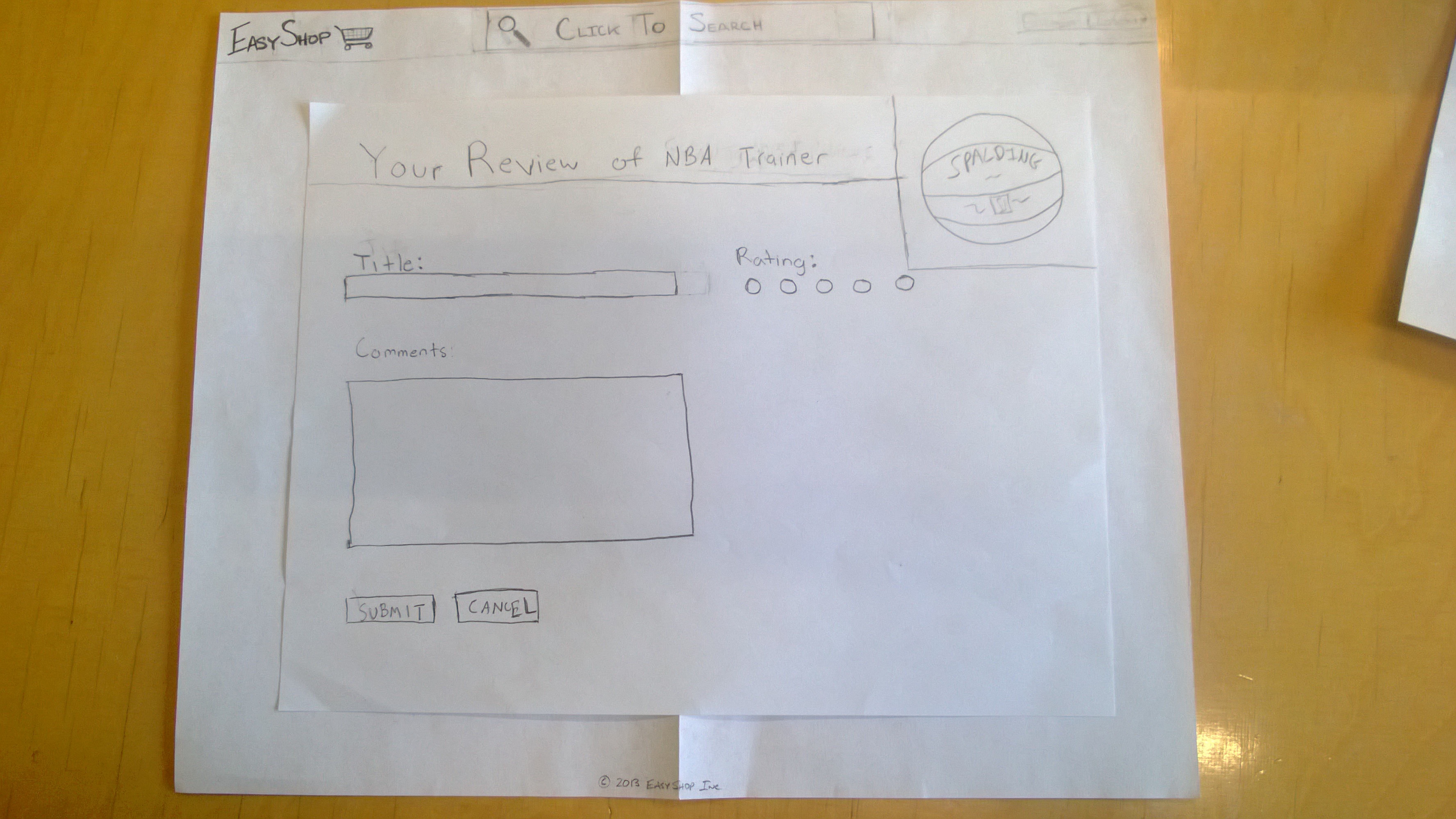
Product review page
Allows user to submit a review. Each review must have a title and a X out of 5 rating to be submitted.
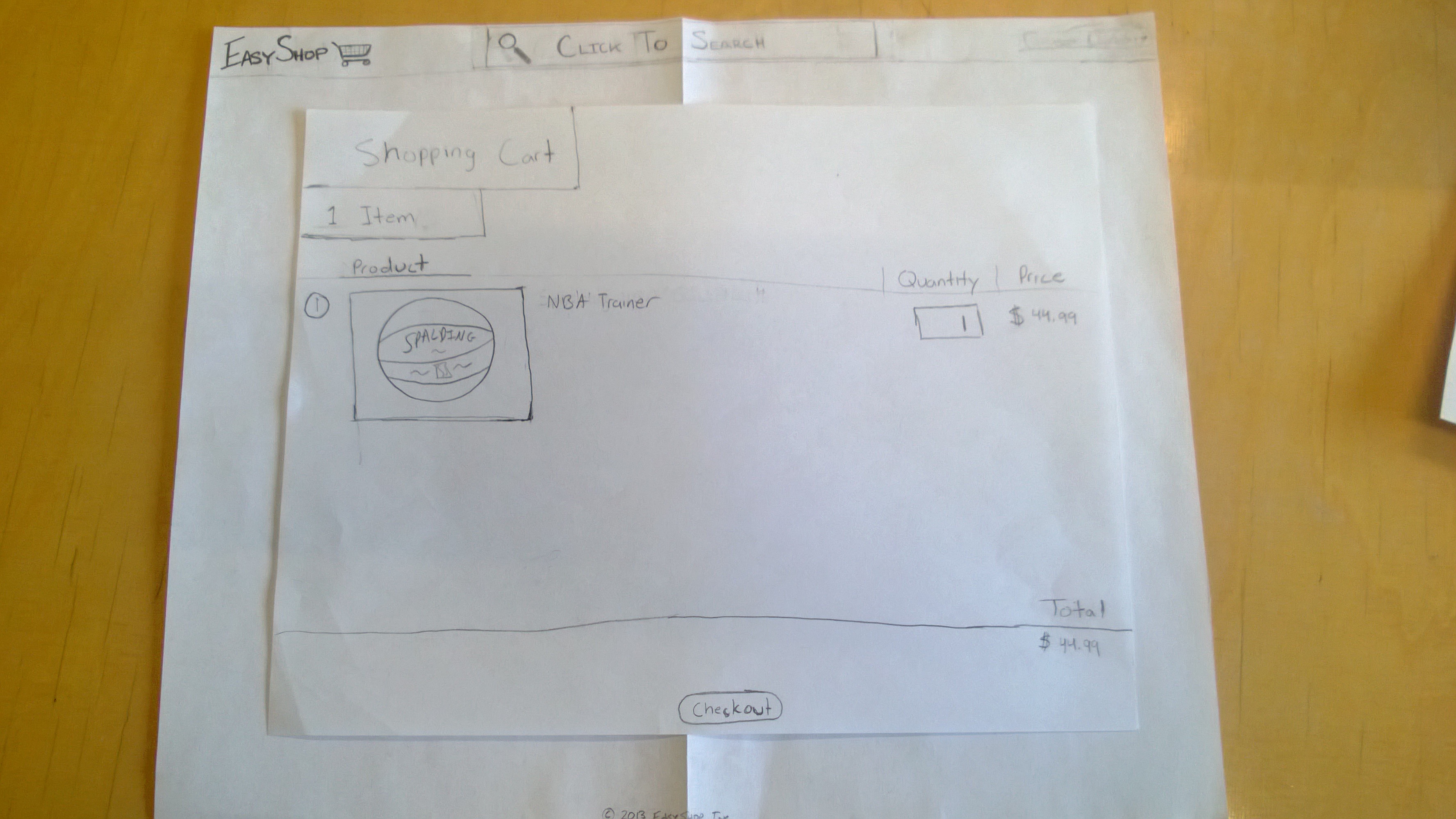
Shopping Cart view
Shows all current elements in the shopping cart along with their cost. The quantity of each item can also be changed. At the bottom of the page is a running total of the cost of the items in the shopping cart.
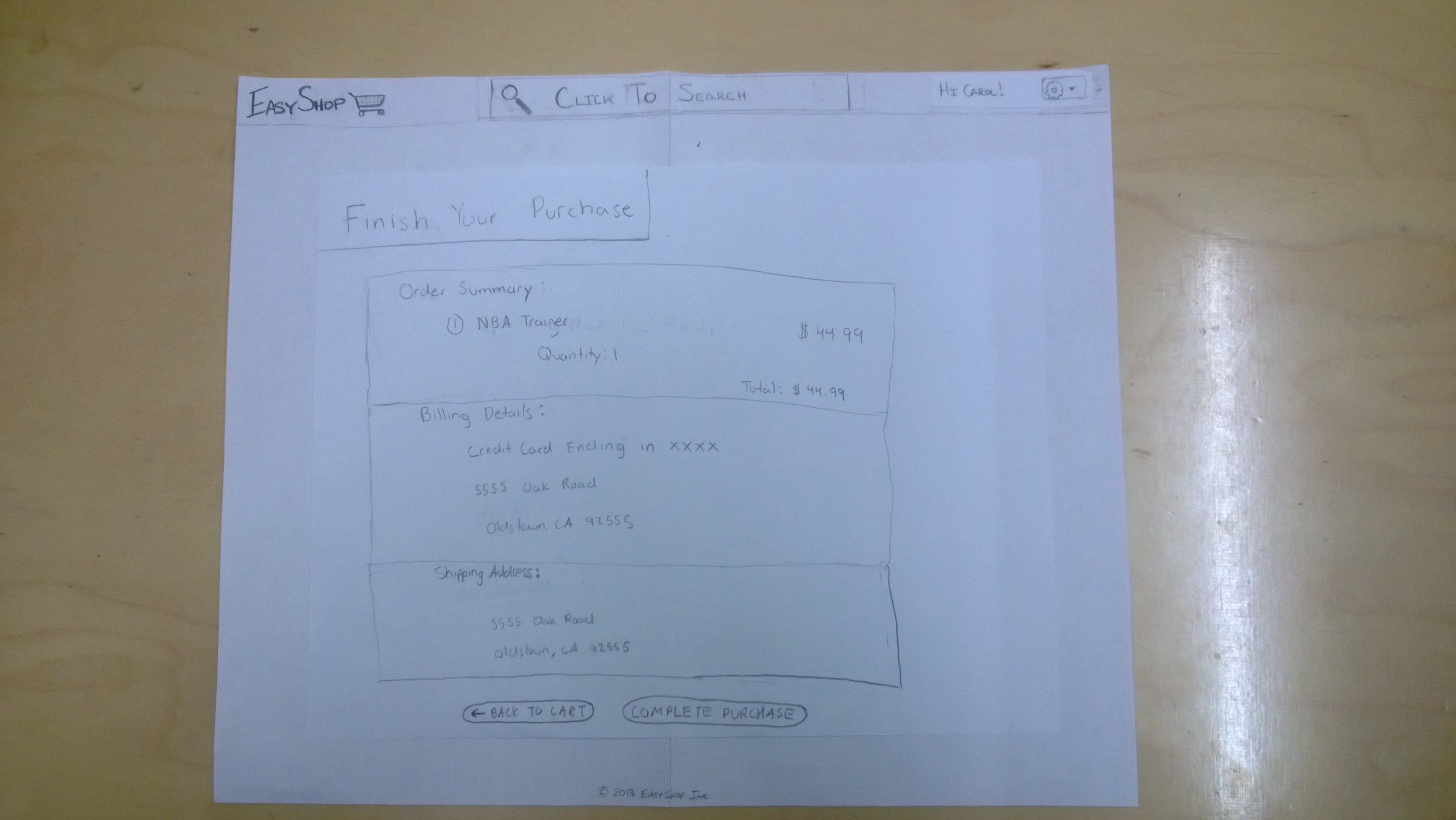
Checkout summary page
Reiterates to the user what items he/she is purchasing, along with billing and shipping information (address, payment method, estimated delivery date, etc.)
Briefing
Thank you for helping us test our shopping site for the elderly. We will be asking you to perform a series of tasks to test the usability of our website. We are not allowed to aid you in the completion of the tasks and we ask you to please think out loud while you are completing these tasks. Sometimes when people concentrate on something they forget to think out loud, so please be aware of this and we will remind you if needed. The more we know about what you want to do and what you think something should do, the better off we are. Remember that you can stop at any time and feel free to ask us any questions after you the test.
Scenario Tasks
We will consider two scenarios: buying a present using the visual interface of our software and purchasing speakers as a visually impaired user utilizing our VoiceAssist mode. Each scenario also contains a visual walk-through attached as a separate page.
Scenario 1 - Buying a Present
You are an elderly person that is looking for a present for your grandson. Your grandson really likes basketball and specifically asked for a Spalding full size basketball. For convenience you already have an account. Visual Walkthrough
Tasks
First purchase
- Log in
- Search for basketball
- Resize results page to be able to see 8 results per page
- Check reviews for the basketball
- Add to cart and checkout
A week later
- Find the basketball you purchased
- Give the product a review
Scenario 2 - Purchasing Speakers (Voice)
You are a visually impaired person that is in the market for some new speakers. A friend told you that Logitech makes some affordable and good quality speakers.
Tasks
- Purchase a set of speakers from the company Logitech
Wizard
Hi, welcome to EasyShop, what are you looking for? Food, Clothing, Electronics, Drugs, or “list more options”? Answer: Electronics
What electronics device are you looking for? TVs, DVD/BluRay player, or Audio devices? Audio devices
What type of audio device are you looking for? MP3, headphones, or speakers? Speakers
We have the following speakers in stock: Bose TrueSound speakers, Logitech Pro speakers, and the Panasonic MaxBass system? Logitech Pro
Logitech Pro speakers are $79.99, would you like to add them to your cart? Yes
The Logitech Pro speakers have been added to your cart.
Observations
First User
Scenario 1:
- Categories naturally selected first
- No sub-category page in first prototype
- Resizing unclear
Scenario 2:
- Found it straight forward
Second User
Scenario 1:
- Initiating checkout confusing
- Font size not large enough in some areas
Scenario 2:
- Found it straight forward
Third User
Scenario 1:
- Unsure if search result was same as previously purchased
- Double search bars confusing
Scenario 2:
- Found it straight forward
Prototype iteration
For our second iteration we changed the following things:
- Increased the font size in certain areas of the website, mainly the log in drop down
- Made the location of the cart more obvious because people were having trouble finding it
- Added a label to the re-sizing widget because some users could not tell what it was
- Gave items a "recently purchased icon" to make it easy to know which items you can review