...
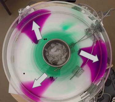
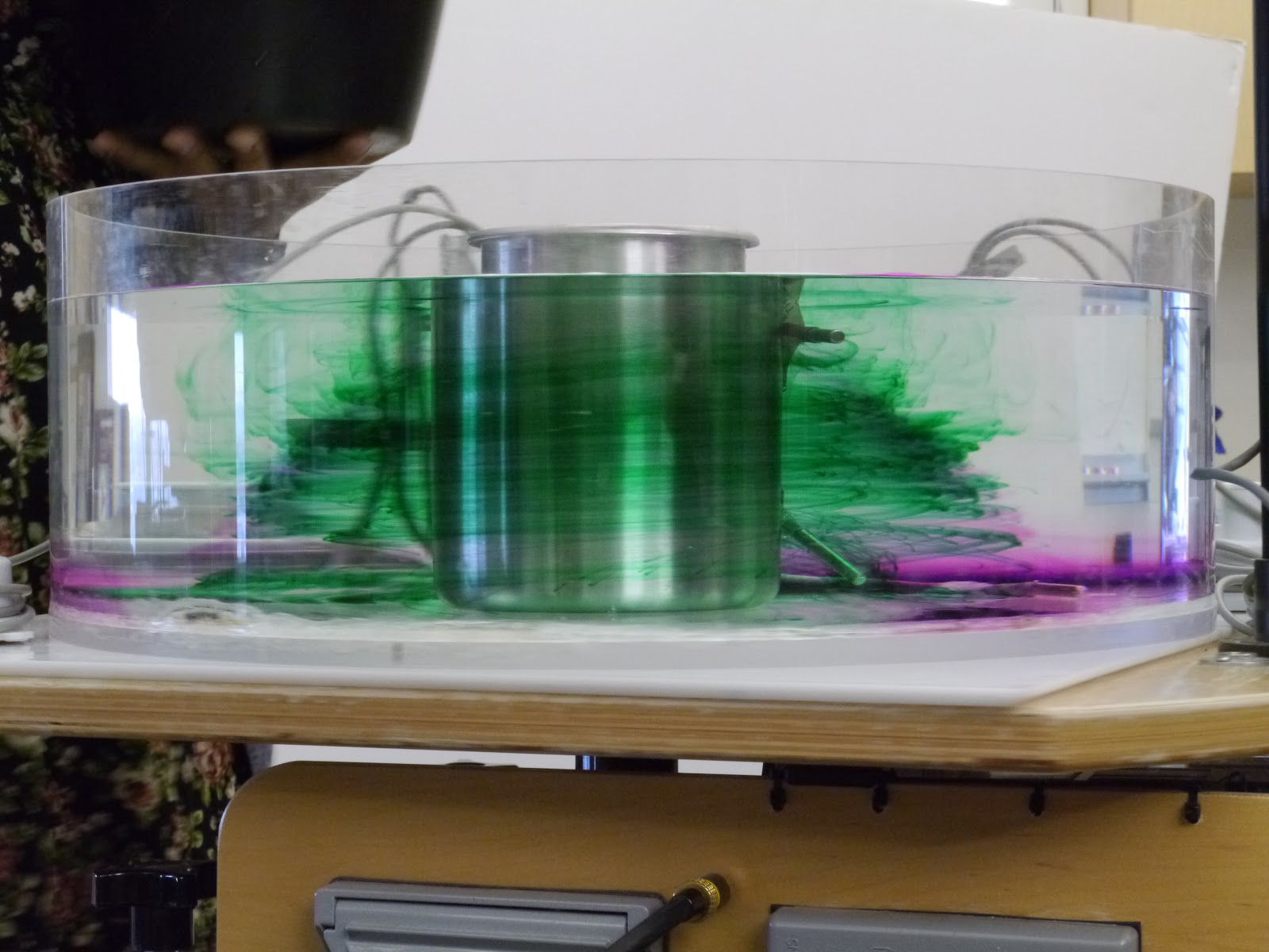
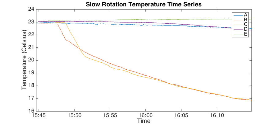
Thermometers B (at the bottom of the outer wall of the ice bucket) and C (on the bottom of the tank) clearly measure much colder temperatures than sensors placed elsewhere. The maximum temperature gradient recorded between B and D, both near the bottom of the tank, is roughly 5.5K The maximum gradient found at the top of the tank is .5K. Averaging these gives an approximate temperature gradient of 3K over the 18 cm region, or 16.67 K/m.
We can recall the thermal wind equation for an incompressible fluid that we derived in our study of fronts:
This relationship relates the fluid horizontal speed in the tank to the tank’s rotation rate and temperature gradient. By plugging in the calculated value for the ∂T/∂r term into this thermal wind relation, we can try to approximate the velocity at the bottom of the tank. Integrating both sides of the equation, we find:

where u(z1) is the average velocity of a particle traveling on the surface of the water (8.5E-2 m/s for this experiment), u(z2) is the average velocity of a particle traveling near the bottom of the tank (assumed to be roughly 0), and Δz is the depth of water in the tank, here roughly 10cm. Plugging in these values, we find that the expected velocity of a particle traveling at the surface of the tank is:

This result is within the same order of magnitude as the observed values of roughly 8.5E-2 m/s. The slight differences are probably due to the inaccuracy of approximating the temperature gradient as the average of the difference at the top and the difference at the bottom. In reality, the temperature gradient was only observed at around the bottom fifth of the tank, but we didn’t have enough thermometers to measure this precisely.
Atmospheric Data
As with the Hadley Cell tank experiment under low rotation described above, through atmospheric data analysis we will find that we can observe similar motions as observed in the tank near the equator, where Coriolis parameter is low and Earth’s rotation is felt very weakly.
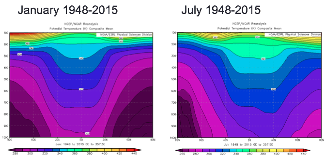
For this study we analyzed zonally averaged data averaged over the years 1948-2015 to observe the general atmospheric circulation trends. NCEP reanalysis data from http://www.esrl.noaa.gov/psd/cgi-bin/data/composites/printpage.pl was plotted during both January and July to observe winters in both the Northern and Southern Hemispheres, during which the temperature gradients and the Hadley Cell circulation would be strongest.
We first plotted the zonally average temperature as shown below:

Note that the temperature gradient is stronger during winter (January in the Northern Hemisphere and July in the Southern Hemisphere). The sloping temperature surfaces shown are analogous to the sloping density surfaces we observed in the tank experiment in our study of fronts.
We next plotted the zonally averaged potential temperatures calculated using the expression we previously derived in our studies of fronts and convection:

Again we observe steeper temperature gradients in the Northern Hemisphere in January and in the Southern Hemisphere in July. Note that potential temperatures over the equatorial region are relatively constant, because there is more moisture in the air above the warmer equatorial regions, according to the Clausius-Clapeyron relation. Above the 200mb height, the shape of the isotherm curves reverses direction, because this is where the stratosphere begins.
Next, we plotted the zonally averaged zonal winds:

Here we observe zonal winds increasing in velocity with height. The strongest thermal winds are located above around 30ºN and 30ºS, where the temperature gradients are strongest. Again, the winds are stronger in the winter.
The correlation between the zonal winds and the potential temperature gradient are more easily observed when overlaying the two data plots:

To further reiterate the relationship between the winds and the temperature gradient, we can recall the expression for thermal wind we derived in our study of fronts in terms of temperature and in pressure coordinates:

We calculate the left hand side (LHS) and right hand side (RHS) of the expression at 30ºN in January and 30ºS in July where and when the zonal winds are strongest using the data from the zonally averaged plots above. The following values were used:
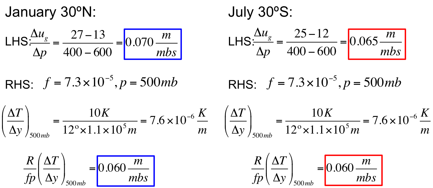
From the above calculations, we see that the the LHS and RHS for both January 30ºN and July 30ºS agree well, showing that the atmosphere obeys the thermal wind relation. We next plotted the zonally averaged vertical winds, given by the formula:

Where ω is negative, the air is rising.

In January, we observe air strongly rising over the equator and strongly sinking around 30ºN. In July, we observe air strongly rising over the equator and strongly sinking around 30ºS. Near the surface in both January and July, the maximums in upward vertical velocity are shifted slightly north of the equator, likely because the Northern Hemisphere has more land, which heats faster than water.
We next plotted the zonally averaged meridional winds where positive values correspond to northward moving winds:

In the January plot, high altitude winds move toward the North Pole from the equator to around 30ºN and low altitude winds move from 30ºN to the equator. The opposite pattern is observed in July.
Combining the vertical, meridional, and zonal wind data helps visualize the Hadley Cell circulation in the atmosphere. Here the meridional wind data is plotted over the vertical wind data, with the zonal components marked:

These plots show the Hadley Cell circulation in the Northern Hemisphere in January and in the Southern Hemisphere in July. We see similar but opposition motions between the two hemispheres.
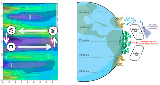
Comparing the overlaid plot of meridional and vertical wind in January with the cartoon shown above we can think about the moisture in the atmosphere. Following the Clausius-Clapeyron relationship, the warm air around the equator is also moist. As this warm moist air rises above the equator, it cools adiabatically and the moisture condenses out of the air, creating precipitation and rainforests in equatorial regions. The air high in the atmosphere follows the Hadley Cell moving to around 30ºN. As the air descends over 30ºN, it adiabatically warms. However, this air is now dry since the moisture was condensed out earlier. Therefore this descent of warm dry air results in many dry desert regions around 30ºN and 30ºS around the world.
Overall, using zonally averaged data, we were able to clearly visualize the Hadley Cell circulation which works to transport heat from the equator to the midlatitudes around 30ºN and 30ºS.